Friday Thoughts...All the Fun of the Fair
What’s new for Interiors in 2024…
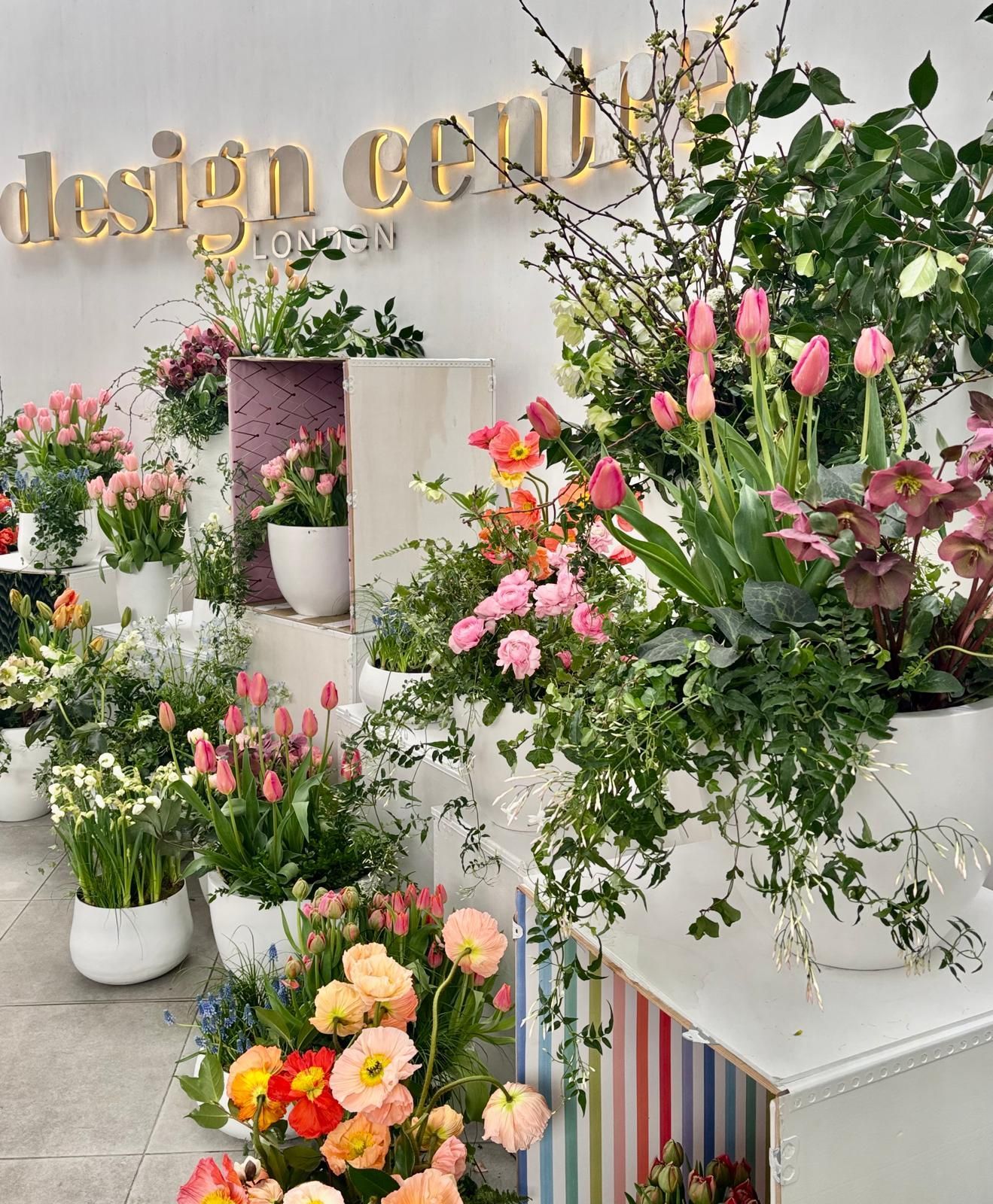
We are fresh back from London Design Week at the Chelsea Harbour Design Centre – five days of interiors-related product launches,
talks and workshops showcasing the best and brightest world-class interiors talent. So much inspiration!
Our design senses were on serious overload…
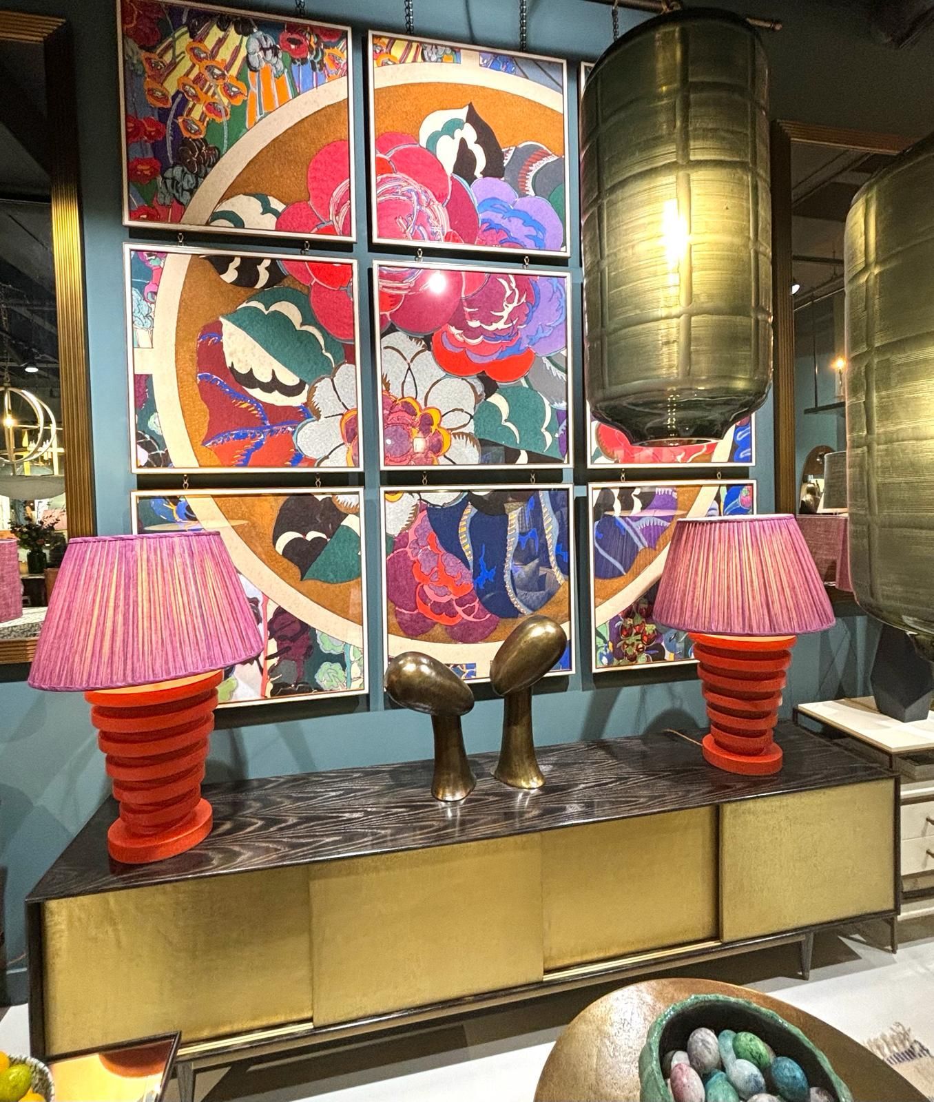
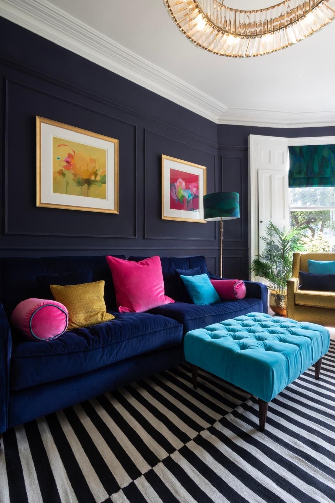
Colour, colour, colour
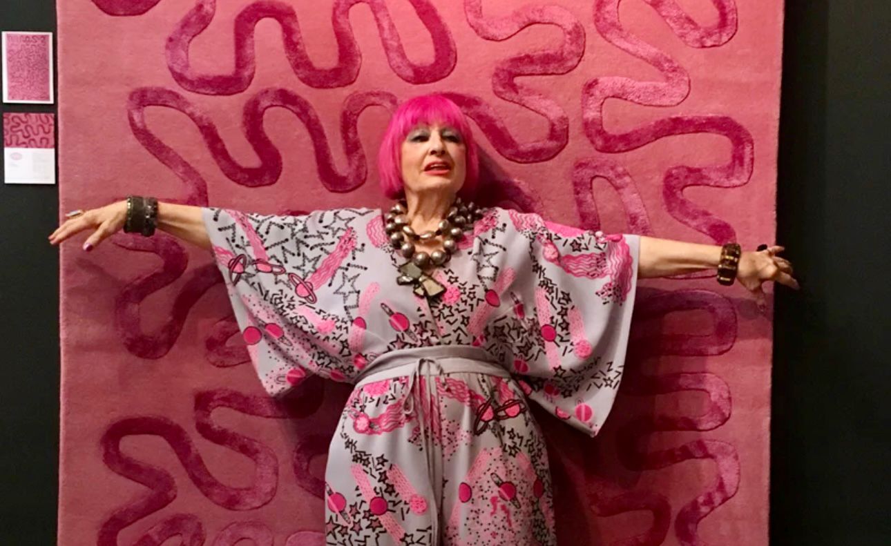
Interestingly this year, more than in previous years, it was a joy to see so much colour and pattern on display. After several years of neutral colour trends, we can definitely confirm that we are now heading towards a joyful colour renaissance in the interior design world. New collections included a plethora of uplifting pattern, texture and colour, including a nod to the seventies in metallic textures, geometric shapes and other bold prints


Design Collaborations
Colour and colour-focussed collaborations seem to be on trend too. To mention a few: designer Kit Kemp delivered a wonderful insight into how her vibrant new collection for GP&J Baker came into being; rug company Bombay Sprout has teemed up with designer Laura Stephens to produce some gorgeous and unusual patterned rugs in an array of colours and made from recycled plastic bottles; and, of course, we were able to leaf through all the fabulous fabrics and wallpapers launched recently by Harlequin in collaboration with Sophie Robinson.
One of the many showrooms that caught our eye was the amazing Mind The Gap, designers and suppliers of super colourful, patterned wallpapers and fabrics. They’d even upholstered a Vespa Scooter in clashing patterns and colours to vamp up their window display – seriously cool!


A beautiful trim will add to your interior scheme the finer details that contribute to a professional, layered design, adding interest as well as a little extra personality. If you need convincing on these, look no further than the signature trims from Schumacher, which include trims in every colour, hue and design you could possibly imagine.
Design Avenue was full of colourful displays created by up and coming designers. Like the colour-Magpies we are, we spotted immediately the incredible pop-up by Clock House Furniture, where key pieces were upholstered in deep and intense pinks, yellows and oranges supplied by Christopher Farr fabrics and cleverly teamed with colourful wooden shapes.


Conclusion
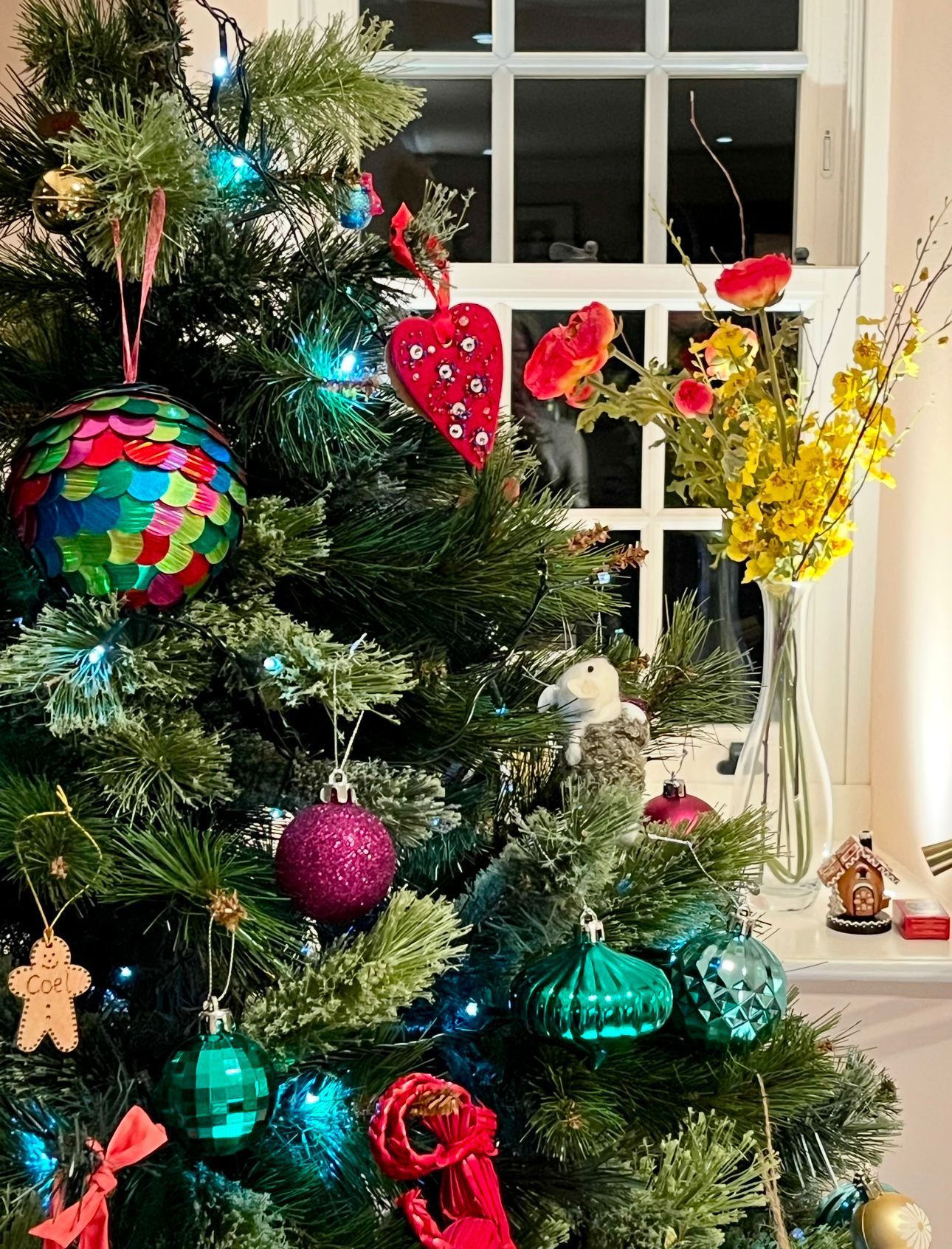
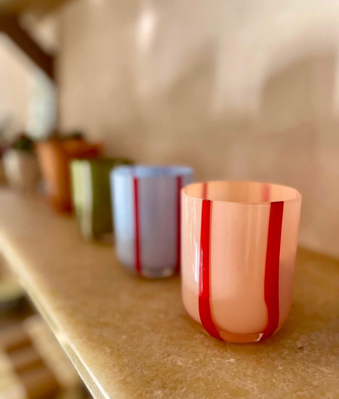
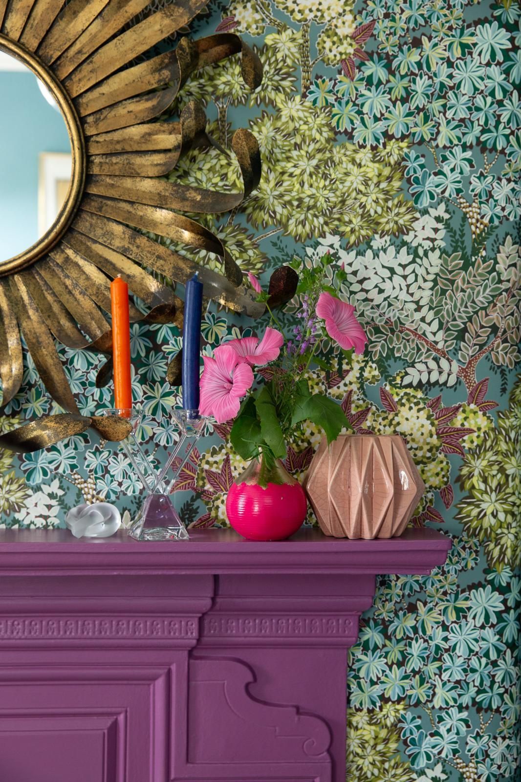
Dopamine décor has arrived!
Why is colour important in our homes?
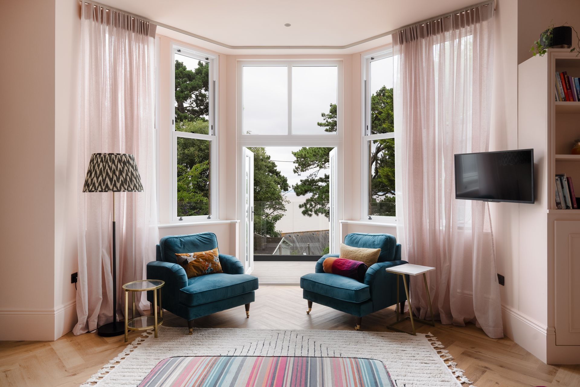
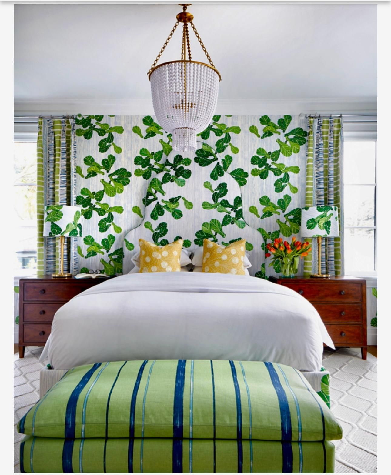
In the UK, we spend a lot of time in our homes and the colours we surround ourselves with can have a huge impact on our general mindset and mood. Use colours, patterns and textures you love and feel the positivity and comfort they provide as you go about day-to day tasks in your home.
‘Colour is a power which directly influences the soul.’ Wassily Kandinsky


Top tip for introducing colour to your home interiors
Always think first about how you want to feel in your space before deciding which colours to use.
Unsure about how to go about using colour in your home?
A great first step would be to book one of our Inspire or Inspire Plus Sessions – a two or three-hour home visit that not only includes lots of clever design ideas and practical solutions, but also a personal colour consultancy session. At the end of your session, you will definitely understand a lot more about the colours, textures and patterns you are most drawn to and how to use these together to create a unique interior scheme that you feel a true connection to. See our website for further details.
If you’re still hanging on for the murky winter days to clear and spring skies to shine through, contact us to chat about any interior projects you have in mind.
We may not be able to control the outside environment, but we can make where you live look fresh, colourful and most importantly feel like home. Book a free discovery call here.
Have a lovely weekend.